import numpy as np
import matplotlib.pyplot as plt
plt.style.use('./deeplearning.mplstyle')
import tensorflow as tf
from tensorflow.keras.models import Sequential
from tensorflow.keras.layers import Dense
from IPython.display import display, Markdown, Latex
from sklearn.datasets import make_blobs
%matplotlib widget
from matplotlib.widgets import Slider
from lab_utils_common import dlc
from lab_utils_softmax import plt_softmax
import logging
logging.getLogger("tensorflow").setLevel(logging.ERROR)
tf.autograph.set_verbosity(0)Activation Functions
We’ve covered two activation functions, linear and logistic regression (sigmoid). Why not use other functions?
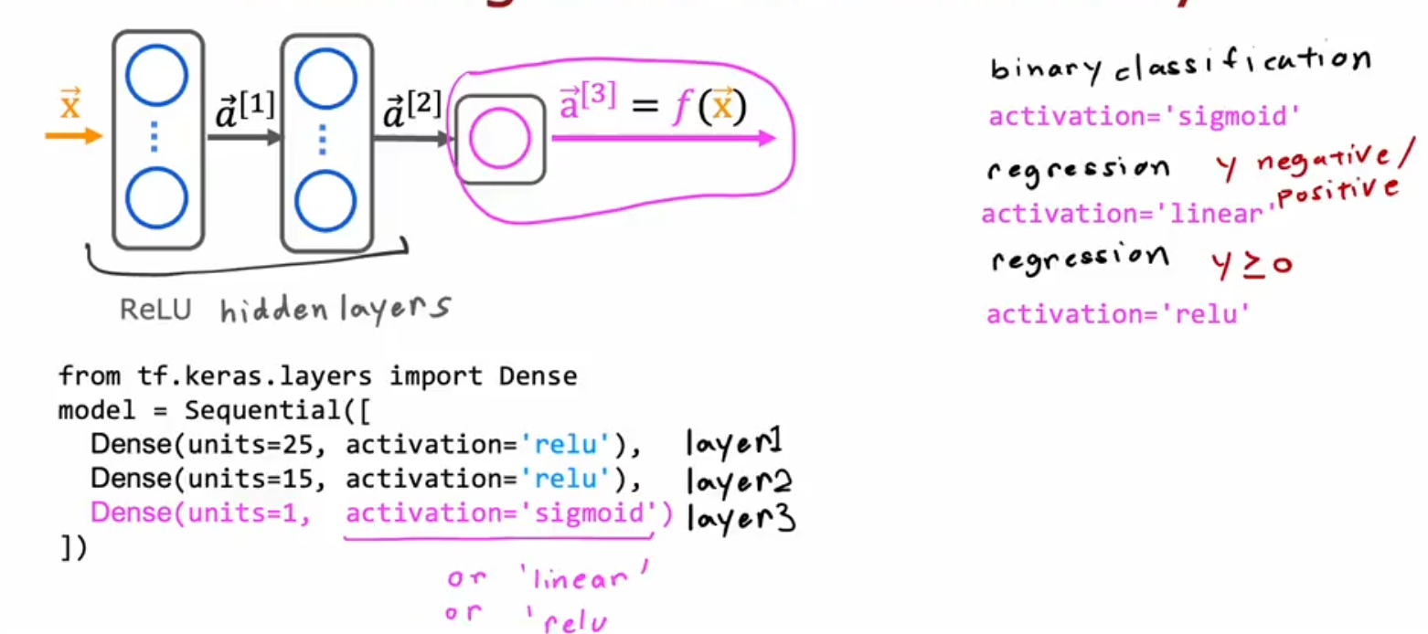
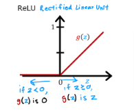
ReLU
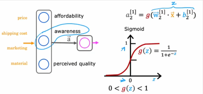
Shown above is a scenario that’s not so binary. What if we want to predict the demand for a product.
- We have data on the price, shipping cost, marketing cost, material of other products
- We want to use an activation function in the first hidden layer to figure out the: affordability, awareness, and perceived quality of the products
- From those predictions we want to predict if the product will be a good selling item or not
- We cannot use a binary activation function because awareness, affordability… are not things we can measure as 0 or 1, also what’s important
- Those values CANNOT take a negative value, in other words awareness cannot be measured as a negative number, but it’s a scale so to speak
- Awareness could be from 0 to a large positive number, so the sigmoid function will not do
- So how do we accomplish that?
- As it turns out we can use this function that will only have positive values and could increase indefinitely at a 45 degree
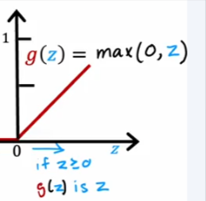
The name of this function is ReLU - Rectifieed Linear Unit
Choices
So here is a recap of the activation functions we’ve covered so far. When is the best time to use each?
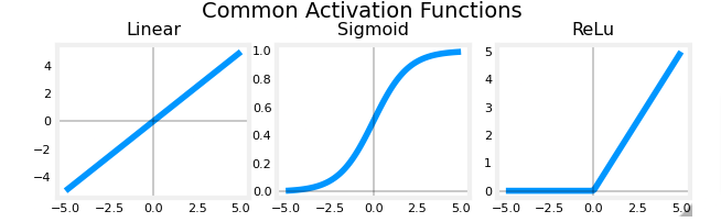
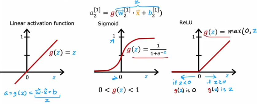
Those are the most used functions in NN.
- It all starts with the label for y which will dictate the natural choice
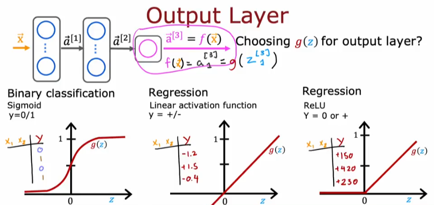
Classification
If you are working on a binary classification problem then the sigmoid will be the choice
Regression Positive or Neg
If you are working on predicting a number (regression problem) then the linear activation function is your choice. For example if you are trying to predict tomorrows stock price based on previous data, which means it could go up or down, then use linear regression function which gives you a negative or positive value
Regression Positive Only
If you are trying to predict a value that can only take on a positive value than the ReLU activation function will be your choice. ReLU has become the choice of most practitioner except for the only case when you are working on a binary problem which requires a 0 or 1 result then you use the sigmoid function.
- ReLU is faster to compute
- ReLU only goes flat at left of 0, while sigmoid goes flat at the top of the curve and at bottom of curve below 0, this will cause GD to slow down because it thinks it found a minimum cost value at one of the flat parts while it might not be accurate.
So a good practice is to use ReLU in the hidden layers even if you are working on a binary output problem, then for the last layer you can use the sigmoid function.
Softmax - Multiclass
Well, what if we have multiple classes to predict in the output. It is not a simple binary 0 or 1 but 10’s maybe 100’s or 1000’s of classes/categories to separate the data into?
Function
Recap of the previous activation function for binary classification
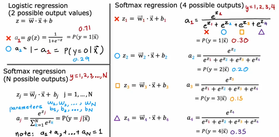
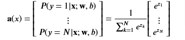
So as we saw before, but this time the total probability will always be equal to 1 P(y=1\x) regardless as to how many categories we are breaking down the data.
The softmax function can be written:
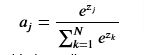
The output vector a is a vector of length N, so we can write it like this which shows the output is a vector of probabilities. The first entry is the probability the input is the first category given the input 𝐱x and parameters 𝐰w and 𝐛b.
def my_softmax(z):
    ez = np.exp(z)              #element-wise exponenial
    sm = ez/np.sum(ez)
return(sm)plt.close("all")
plt_softmax(my_softmax)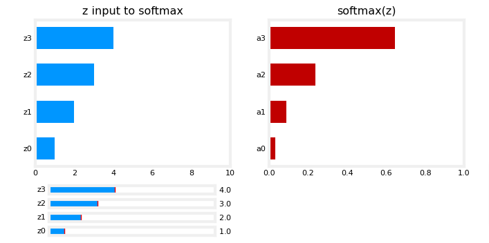
As you are varying the values of the z’s above, there are a few things to note:
- the exponential in the numerator of the softmax magnifies small differences in the values
- the output values sum to one
- the softmax spans all of the outputs. A change in
z0for example will change the values ofa0-a3. Compare this to other activations such as ReLU or Sigmoid which have a single input and single output.
Cost
Loss
One thing to note:
- The larger aj is the smaller the loss and
- The smaller aj is the larger the loss
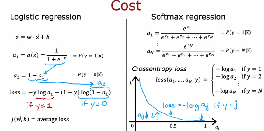
The loss function associated with softmax, the cross-entropy loss is
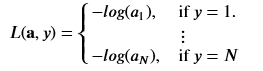
where y is the target category for this example and a is the output of a softmax function. The values in a are probabilities that sum to one
So the cost function will be
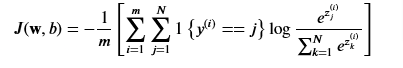
where m is the number of examples, N is the number of outputs and J() is the average of ALL the losses.
Tensorflow has two potential formats for target values and the selection of the loss defines which is expected.
- SparseCategorialCrossentropy: expects the target to be an integer corresponding to the index. For example, if there are 10 potential target values, y would be between 0 and 9.
- CategoricalCrossEntropy: Expects the target value of an example to be one-hot encoded where the value at the target index is 1 while the other N-1 entries are zero. An example with 10 potential target values, where the target is 2 would be [0,0,1,0,0,0,0,0,0,0]
Code
We will use plotting functions found in the ~utils.py
import numpy as np
import matplotlib.pyplot as plt
%matplotlib widget
from sklearn.datasets import make_blobs
import tensorflow as tf
from tensorflow.keras.models import Sequential
from tensorflow.keras.layers import Dense
np.set_printoptions(precision=2)
from lab_utils_multiclass_TF import *
import logging
logging.getLogger("tensorflow").setLevel(logging.ERROR)
tf.autograph.set_verbosity(0)
Create Data
Let’s create a 4 category dataset
# make 4-class dataset for classification
classes = 4
m = 100
centers = [[-5, 2], [-2, -2], [1, 2], [5, -2]]
std = 1.0
X_train, y_train = make_blobs(n_samples=m, centers=centers, cluster_std=std,random_state=30)
plt_mc(X_train,y_train,classes, centers, std=std)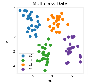
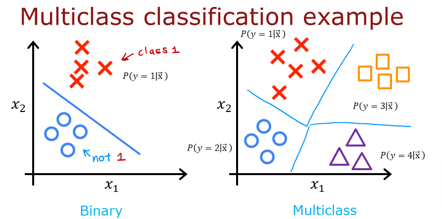
Each dot represents a training example. The axis (x0,x1) are the inputs and the color represents the class the example is associated with. Once trained, the model will be presented with a new example, (x0,x1), and will predict the class.
While generated, this data set is representative of many real-world classification problems. There are several input features (x0,…,xn) and several output categories. The model is trained to use the input features to predict the correct output category.
# show classes in data set
print(f"unique classes {np.unique(y_train)}")
# show how classes are represented
print(f"class representation {y_train[:10]}")
# show shapes of our dataset
print(f"shape of X_train: {X_train.shape}, shape of y_train: {y_train.shape}")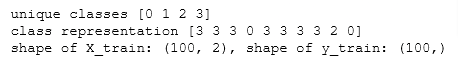
Create Model
Layers
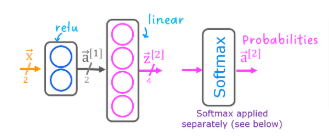
Notice the output layer uses a
linearrather than asoftmaxactivation. While it is possible to include the softmax in the output layer, it is more numerically stable if linear outputs are passed to the loss function during training. If the model is used to predict probabilities, the softmax can be applied at that point.
tf.random.set_seed(1234)  # applied to achieve consistent results
model = Sequential(
    [
        Dense(2, activation = 'relu',   name = "L1"),
        Dense(4, activation = 'linear', name = "L2")
    ]
)
Compile & Train
model.compile(
    loss=tf.keras.losses.SparseCategoricalCrossentropy(from_logits=True),
    optimizer=tf.keras.optimizers.Adam(0.01),
)

model.fit(
    X_train,y_train,
    epochs=200
)
View Classifications
With the model trained let’s see how the model classified the training data
plt_cat_mc(X_train, y_train, model, classes)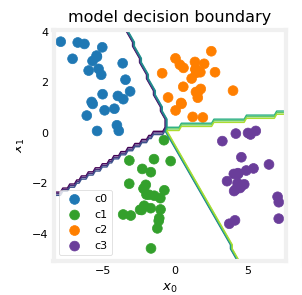
So how did the model accomplish to choose those boundaries?
Below, we will pull the trained weights from the model and use that to plot the function of each of the network units. Further down, there is a more detailed explanation of the results. You don’t need to know these details to successfully use neural networks, but it may be helpful to gain more intuition about how the layers combine to solve a classification problem.
# gather the trained parameters from the first layer
l1 = model.get_layer("L1")
W1,b1 = l1.get_weights()
# plot the function of the first layer
plt_layer_relu(X_train, y_train.reshape(-1,), W1, b1, classes)
# gather the trained parameters from the output layer
l2 = model.get_layer("L2")
W2, b2 = l2.get_weights()
# create the 'new features', the training examples after L1 transformation
Xl2 = np.maximum(0, np.dot(X_train,W1) + b1)

plt_output_layer_linear(Xl2, y_train.reshape(-1,), W2, b2, classes,
                        x0_rng = (-0.25,np.amax(Xl2[:,0])), x1_rng = (-0.25,np.amax(Xl2[:,1])))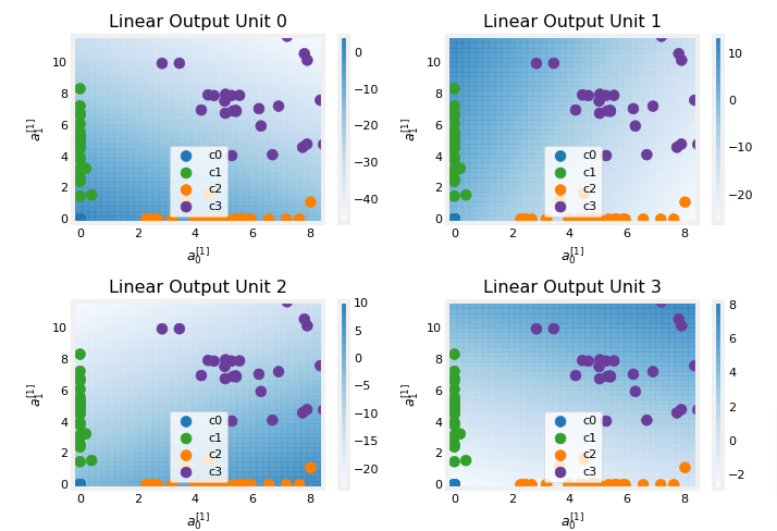
Layer 1
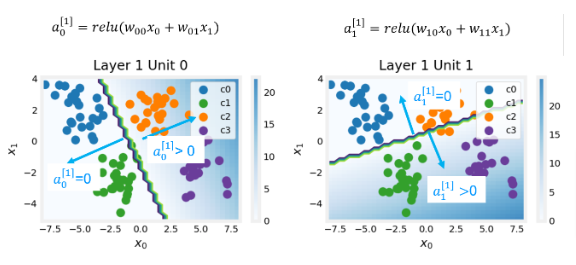
These plots show the function of Units 0 and 1 in the first layer of the network. The inputs are (𝑥0,𝑥1x0,x1) on the axis. The output of the unit is represented by the color of the background. This is indicated by the color bar on the right of each graph. Notice that since these units are using a ReLu, the outputs do not necessarily fall between 0 and 1 and in this case are greater than 20 at their peaks. The contour lines in this graph show the transition point between the output, 𝑎[1]𝑗aj[1] being zero and non-zero. Recall the graph for a ReLu
The contour line in the graph is the inflection point in the ReLu.
Unit 0 has separated classes 0 and 1 from classes 2 and 3. Points to the left of the line (classes 0 and 1) will output zero, while points to the right will output a value greater than zero.
Unit 1 has separated classes 0 and 2 from classes 1 and 3. Points above the line (classes 0 and 2 ) will output a zero, while points below will output a value greater than zero. Let’s see how this works out in the next layer!
Layer 2
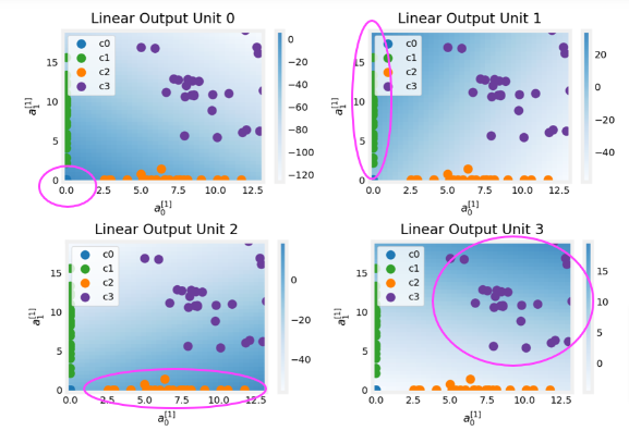
This being the output layer. The dots in these graphs are the training examples translated by the first layer. One way to think of this is the first layer has created a new set of features for evaluation by the 2nd layer. The axes in these plots are the outputs of the previous layer 𝑎[1]0a0[1] and 𝑎[1]1a1[1]. As predicted above, classes 0 and 1 (blue and green) have 𝑎[1]0=0a0[1]=0 while classes 0 and 2 (blue and orange) have 𝑎[1]1=0a1[1]=0.
Once again, the intensity of the background color indicates the highest values.
Unit 0 will produce its maximum value for values near (0,0), where class 0 (blue) has been mapped.
Unit 1 produces its highest values in the upper left corner selecting class 1 (green).
Unit 2 targets the lower right corner where class 2 (orange) resides.
Unit 3 produces its highest values in the upper right selecting our final class (purple).
One other aspect that is not obvious from the graphs is that the values have been coordinated between the units. It is not sufficient for a unit to produce a maximum value for the class it is selecting for, it must also be the highest value of all the units for points in that class. This is done by the implied softmax function that is part of the loss function (SparseCategoricalCrossEntropy). Unlike other activation functions, the softmax works across all the outputs.