~\AI\ML\Stanford_Ng>py -m venv mlvenv
~\AI\ML\Stanford_Ng>mlvenv\Scripts\activate

(mlvenv) ~\AI\ML\Stanford_Ng>pip install ipykernel
(mlvenv) ~\AI\ML\Stanford_Ng>python -m ipykernel install --user --name=mlvenv --display-name "ML venv"Cost Function
My thanks and credit to Stanford University & Andrew Ng for their contributions.
In the previous page we covered the basic linear regression equation for one variable, the straight line that results from it. Let’s keep it simple still by using the same equation/function and let’s find out: How do we know how well the model is doing? What we can do is measure the value of the cost function.
Is used in many linear regression and other models used in machine learning for most regression models especially linear regression models. Other functions are used for other models
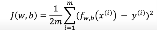
Cost function tells us how well the model is doing so we can improve on it. The cost function is referred to as J(w,b) and is known as the squared error cost function
The equation for cost with one variable is:
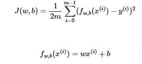
fw,b(x(i)) is our prediction for example i using parameters w,b which we’ll replace with \(\hat{y}\) (i)
( \(\hat{y}\) (i)−y(i))2 is the squared difference between the target value and the prediction.
These differences are summed over all the m examples and divided by
2mto produce the cost, J(w,b).
- So in our linear example above, the parameters w,b will affect the the line drawn and used to make predictions
Let’s go through some examples:
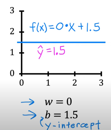
- if w =0 and b=1.5 we get we have a slope of 0 and this line
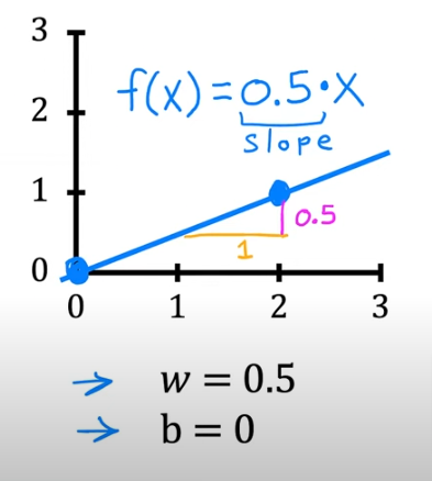
- if w=0.5 and b=0 we get a slope of 0.5 and a y-intercept of 0 with this line
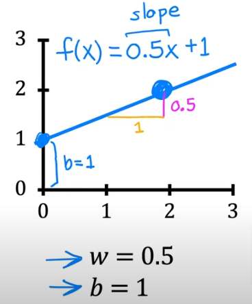
- if w=0.5 and b=1 we again have a slope of 0.5 but watch the y-intercept
So bottom line we have to choose w & b to maximize the accuracy of the predicted values. The best way to do that is
- calculate the distance between the estimated y or \(\hat{y}\) from the actual plotted point y(i) . Or the distance between the line and y(i)
- square the result to eliminate negative values
- sum all the deviations from the line of regression
- then divide by the total number of rows (training sets) which is multiplied by 2. The factor of 2 doesn’t affect anything but make the results look more appealing
- so we basically take the difference or error between \(\hat{y}\) - y
- the goal is to minimize J
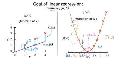
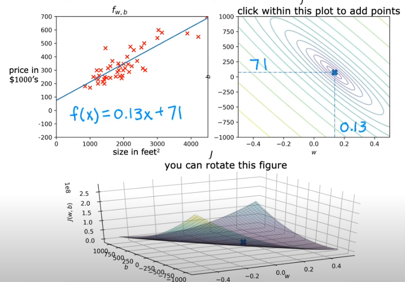
- The goal is to find a model fw,b(x)=wx+b, with parameters w,b, which will accurately predict house values given an input x. The cost is a measure of how accurate the model is on the training data.
- The cost equation above shows that if w and b can be selected such that the predictions fw,b(x) match the target data y, the (fw,b(x(i))−y(i))2 term will be zero and the cost minimized.
- In the previous page, we determined that b=100 provided an optimal solution so let’s set b to 100 and focus on w.
Intuition Plot
Below in the code section you’ll see the plot of intuition a function included in the files. Remember we fixed b=100
The plot contains a few points that are worth mentioning.
- cost is minimized when w=200, which matches results from the previous lab
- Because the difference between the target and pediction is squared in the cost equation, the cost increases rapidly when w is either too large or too small.
- Using the
wandbselected by minimizing cost results in a line which is a perfect fit to the data.
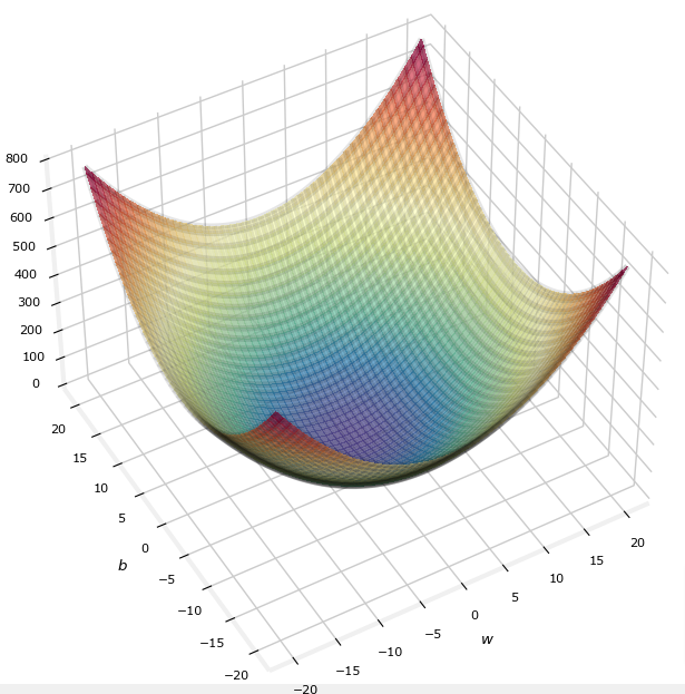
If we plot J(w) both parameters we get a 3 dimensional plot that looks like a bowl sitting right up, and the best way to view it is to cut slices horizontally and end up as rings.
So if you flip it on its head where it is curved up it would be like looking straight down on a mountain from a birds eye view. Now if we slice it horizontally you will get rings. The J plot below is stretched out so it almost looks flat
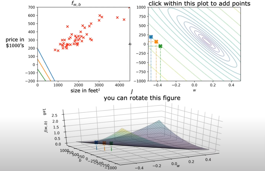
The minimum value of error or the most efficient values for w & b parameters would be in the eye of the storm so to speak, the center of the eclipses.
- In the image above you see the corresponding linear regression lines associated with the 3 colored points on the rings. Not even close to being an efficient regression just by looking at it as the the actual plotted points are not close to any of the three
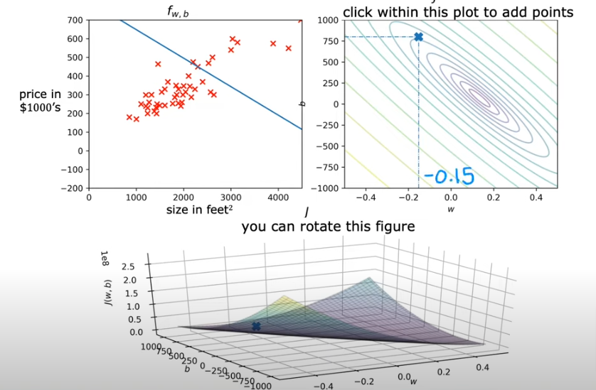
- In the image below we make another guess at w=-0.15 & b=800; and see that the corresponding line is also not a good regression at f(x)=-0.15x + 800 (slope is -0.15 with y intercept =800) and that is obvious as the x on the eclipse is far from the center of the eclipses. So the cost is pretty high
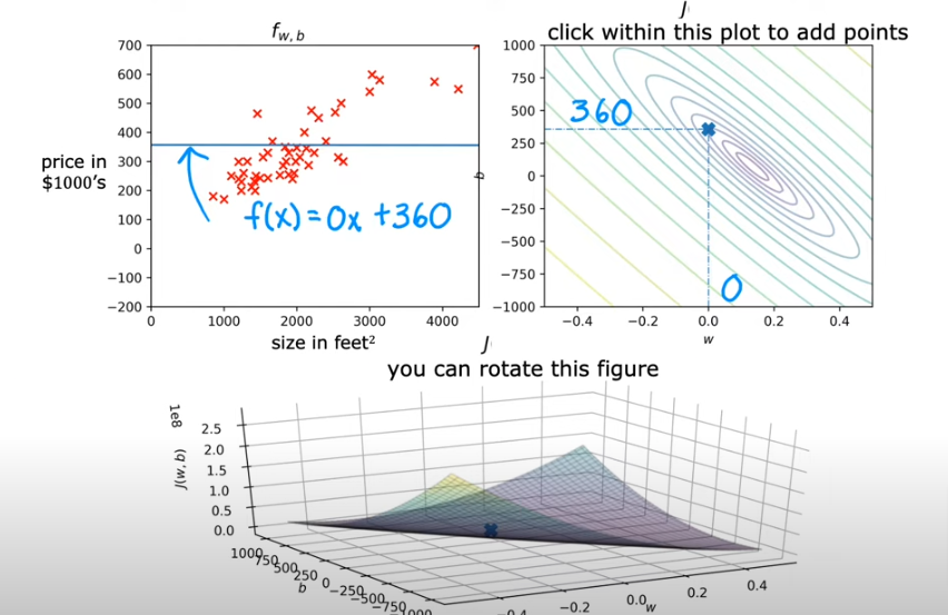
- Here below we take a point closer to the center and we get
- In the last example below, we try to get as close to the center as we can with the human eye and we get
Obviously it is more efficient to find the best fit line using a calculated value and not try it by eye. So we will cover that next. There is an algorithm that accomplishes that and it is called Gradient Descent.
Code
Here is the code for most of the explanations above:
Setup
- We are using the same model from the page before, a linear regression model for one variable
- The data is still the same regarding the housing data
- We are in the mlvenv virtual environment
- We will activate it first then
- We will install ipykernel
- We will assign a name to it (optional)
- Steps were done before, so all we do here is open jupyter notebook in the activated mlvenv and choose the kernel from the dropdown
.
Install
pip install numpy
pip install matplotlib
pip install ipympl
import numpy as np
#%matplotlib widget
import matplotlib.pyplot as plt
from lab_utils_uni import plt_intuition, plt_stationary, plt_update_onclick, soup_bowl
plt.style.use('./deeplearning.mplstyle')Data
- Same as the previous page
x_train = np.array([1.0, 2.0])           #(size in 1000 square feet)
y_train = np.array([300.0, 500.0])           #(price in 1000s of dollars)
Cost Calculation
The code below calculates cost by looping over each example. In each loop:
f_wb, a prediction is calculated- the difference between the target and the prediction is calculated and squared.
- this is added to the total cost.
def compute_cost(x, y, w, b):
    """
    Computes the cost function for linear regression.

    Args:
      x (ndarray (m,)): Data, m examples
      y (ndarray (m,)): target values
      w,b (scalar)    : model parameters

    Returns
        total_cost (float): The cost of using w,b as the parameters for linear regression
               to fit the data points in x and y
    """
    # number of training examples
    m = x.shape[0]

    cost_sum = 0
    for i in range(m):
        f_wb = w * x[i] + b
        cost = (f_wb - y[i]) ** 2
        cost_sum = cost_sum + cost
    total_cost = (1 / (2 * m)) * cost_sum

    return total_cost
def plt_intuition(x_train, y_train):
w_range = np.array([200-200,200+200])
tmp_b = 100
w_array = np.arange(*w_range, 5)
cost = np.zeros_like(w_array)
for i in range(len(w_array)):
tmp_w = w_array[i]
cost[i] = compute_cost(x_train, y_train, tmp_w, tmp_b)
@interact(w=(*w_range,10),continuous_update=False)
def func( w=150):
f_wb = np.dot(x_train, w) + tmp_b
fig, ax = plt.subplots(1, 2, constrained_layout=True, figsize=(8,4))
fig.canvas.toolbar_position = 'bottom'
mk_cost_lines(x_train, y_train, w, tmp_b, ax[0])
plt_house_x(x_train, y_train, f_wb=f_wb, ax=ax[0])
ax[1].plot(w_array, cost)
cur_cost = compute_cost(x_train, y_train, w, tmp_b)
ax[1].scatter(w,cur_cost, s=100, color=dldarkred, zorder= 10, label= f"cost at w={w}")
ax[1].hlines(cur_cost, ax[1].get_xlim()[0],w, lw=4, color=dlpurple, ls='dotted')
ax[1].vlines(w, ax[1].get_ylim()[0],cur_cost, lw=4, color=dlpurple, ls='dotted')
ax[1].set_title("Cost vs. w, (b fixed at 100)")
ax[1].set_ylabel('Cost')
ax[1].set_xlabel('w')
ax[1].legend(loc='upper center')
fig.suptitle(f"Minimize Cost: Current Cost = {cur_cost:0.0f}", fontsize=12)
plt.show()plt_intuition(x_train,y_train)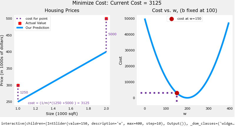
Additional Data
- This is just a reiteration of the section above with the plotting functions provided as reference in the lab_utils_uni.py
x_train = np.array([1.0, 1.7, 2.0, 2.5, 3.0, 3.2])
y_train = np.array([250, 300, 480, 430, 630, 730,])plt.close('all')
fig, ax, dyn_items = plt_stationary(x_train, y_train)
updater = plt_update_onclick(fig, ax, x_train, y_train, dyn_items)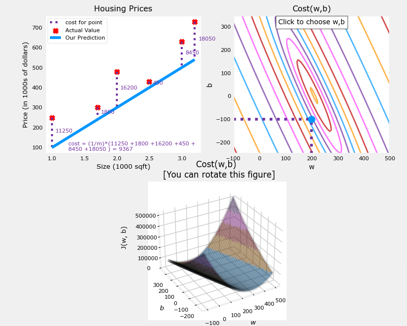
- The dashed lines in the left plot, represent the portion of the cost contributed by each example in our training set.
- If you eyeball the eye of the storm, the minimum cost it’s at about w=209 and b=2.4
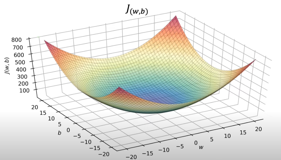
- The lower plot is not like a soup bowl because w and b scale differently and are not symetrical
- If they were to be symmetrical we get the image below
def soup_bowl():
    """ Create figure and plot with a 3D projection"""
    fig = plt.figure(figsize=(8,8))

    #Plot configuration
    ax = fig.add_subplot(111, projection='3d')
    ax.xaxis.set_pane_color((1.0, 1.0, 1.0, 0.0))
    ax.yaxis.set_pane_color((1.0, 1.0, 1.0, 0.0))
    ax.zaxis.set_pane_color((1.0, 1.0, 1.0, 0.0))
    ax.zaxis.set_rotate_label(False)
    ax.view_init(45, -120)

    #Useful linearspaces to give values to the parameters w and b
    w = np.linspace(-20, 20, 100)
    b = np.linspace(-20, 20, 100)

    #Get the z value for a bowl-shaped cost function
    z=np.zeros((len(w), len(b)))
    j=0
    for x in w:
        i=0
        for y in b:
            z[i,j] = x**2 + y**2
            i+=1
        j+=1

    #Meshgrid used for plotting 3D functions
    W, B = np.meshgrid(w, b)

    #Create the 3D surface plot of the bowl-shaped cost function
    ax.plot_surface(W, B, z, cmap = "Spectral_r", alpha=0.7, antialiased=False)
    ax.plot_wireframe(W, B, z, color='k', alpha=0.1)
    ax.set_xlabel("$w$")
    ax.set_ylabel("$b$")
    ax.set_zlabel("$J(w,b)$", rotation=90)
    ax.set_title("$J(w,b)$\n [You can rotate this figure]", size=15)

    plt.show()
soup_bowl()