import numpy as np
import scipy
from scipy.stats import norm
import matplotlib.pyplot as plt
from lab_utils_multi import  load_house_data, run_gradient_descent
from lab_utils_multi import  norm_plot, plt_equal_scale, plot_cost_i_w
from lab_utils_common import dlc
np.set_printoptions(precision=2)
plt.style.use('./deeplearning.mplstyle')Feature Scaling
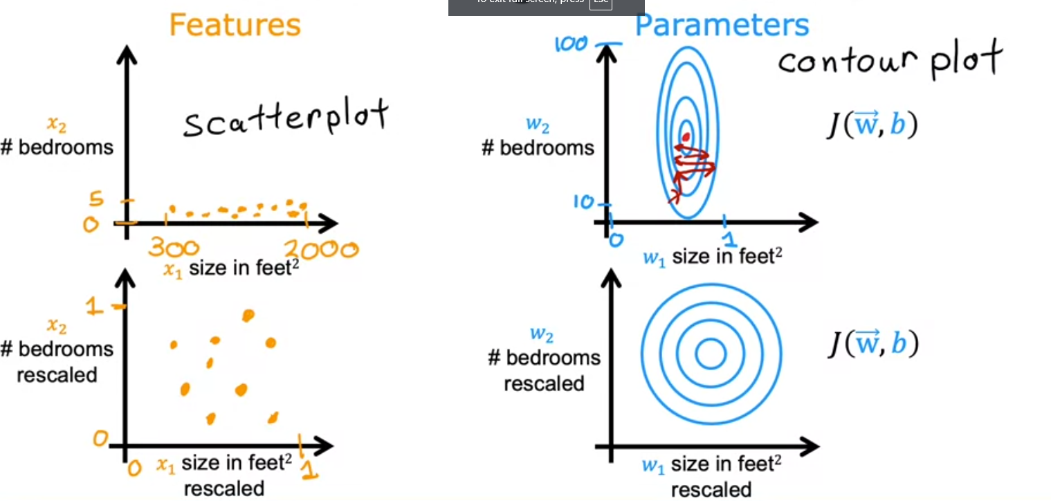
So how can we manipulate the feature multipliers to make the model more efficient and decrease the iterations needed to achieve good results.
Using the house prediction model, we know as a fact that each feature has and should have a different effect on the price of a house. So we should start by using more reasonable estimates for the multipliers.
- Let’s plot the size in feet vs # of bedrooms. You notice that the horiz axis has a much broader range than the y axis
- What that does to the Cost function J(w,b) is make it a contour plot, a more vertical and narrow plot where a change in the x axis can have a large change on the y axis
- But a largel change in the y axis can have almost no effect on the x axis
- small changes to w doesn’t change the cost function much
- Because the contour are so tall and skinny it might bounce back and forth and never converge
- So what’s the solution
- Rescale
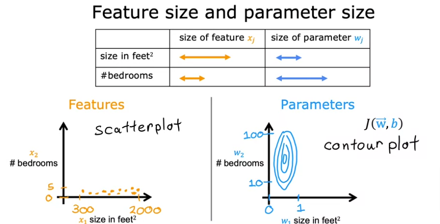
- So if we scale both axes to have values between 0 - 1 we would have something similar to this
Feature vs Price
Let’s see how much of an influence each feature has on the price of the house, so let’s plot them
.
Load Data Function
def load_house_data():
    data = np.loadtxt("./data/houses.txt", delimiter=',', skiprows=1)
    X = data[:,:4]
    y = data[:,4]
    return X, y
# load the dataset
X_train, y_train = load_house_data()
X_features = ['size(sqft)','bedrooms','floors','age']fig,ax=plt.subplots(1, 4, figsize=(12, 3), sharey=True)
for i in range(len(ax)):
ax[i].scatter(X_train[:,i],y_train)
ax[i].set_xlabel(X_features[i])
ax[0].set_ylabel("Price (1000's)")
plt.show()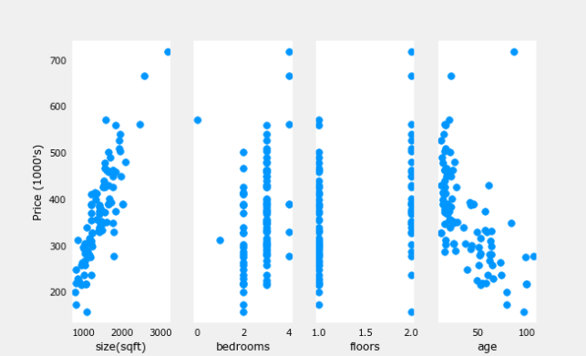
Plotting each feature vs. the target, price, provides some indication of which features have the strongest influence on price. Above, increasing size also increases price. Bedrooms and floors don’t seem to have a strong impact on price. Newer houses have higher prices than older houses.
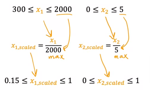
Scaling
Divide by Max
We can divide by the max value, would yield a set of values less than 1
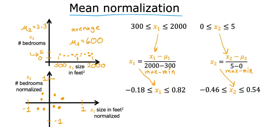
Mean Normalization
- Center values around 0
- First find the mean or average \(\mu\)
- Take each value and subtract xi - \(\mu\) then divide by max - min
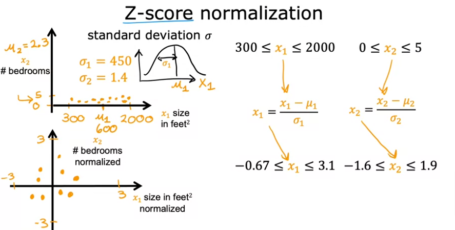
Z-Score Normalization
- Calculate the standard deviation \(\sigma\)
- Calculate the mean \(\mu\)
- Subtract xi - \(\mu ~i~\)
- Divide by \(\sigma~i~\)
- You want to aim for values between -1 to 1 or symmetrical values as long as they are not in the hundreds like -100 to 100 or from -0.001 to 0.001
- Another example is body temperature in a hospital setting from 98.6 to 105 would be worth rescaling
Engineering
- Aside from scaling we can engineer our features to be more efficient. For example:
- Instead of using lot width and lot depth as two features for the model we can combine the two as one being the lot area: width X depth and make that a new feature instead of the other two.
- The lot area is more effective as a price indicator than the two dimensions compromising the calculated feature
- This is called feature engineering
See code for this section in plonomial page
Code
Z-score normaliztion
Plot the Steps
mu     = np.mean(X_train,axis=0)
sigma  = np.std(X_train,axis=0)
X_mean = (X_train - mu)
X_norm = (X_train - mu)/sigma

fig,ax=plt.subplots(1, 3, figsize=(12, 3))
ax[0].scatter(X_train[:,0], X_train[:,3])
ax[0].set_xlabel(X_features[0]); ax[0].set_ylabel(X_features[3]);
ax[0].set_title("unnormalized")
ax[0].axis('equal')

ax[1].scatter(X_mean[:,0], X_mean[:,3])
ax[1].set_xlabel(X_features[0]); ax[0].set_ylabel(X_features[3]);
ax[1].set_title(r"X - $\mu$")
ax[1].axis('equal')

ax[2].scatter(X_norm[:,0], X_norm[:,3])
ax[2].set_xlabel(X_features[0]); ax[0].set_ylabel(X_features[3]);
ax[2].set_title(r"Z-score normalized")
ax[2].axis('equal')
plt.tight_layout(rect=[0, 0.03, 1, 0.95])
fig.suptitle("distribution of features before, during, after normalization")
plt.show()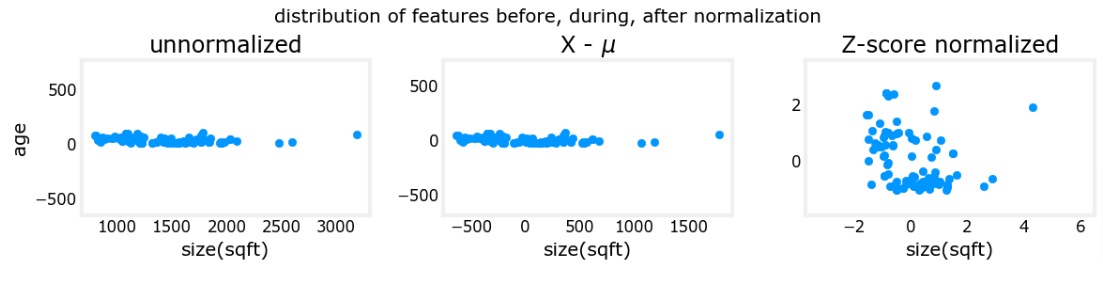
The plot above shows the relationship between two of the training set parameters, “age” and “size(sqft)”. These are plotted with equal scale.
- Left: Unnormalized: The range of values or the variance of the ‘size(sqft)’ feature is much larger than that of age
- Middle: The first step removes the mean or average value from each feature. This leaves features that are centered around zero. It’s difficult to see the difference for the ‘age’ feature, but ‘size(sqft)’ is clearly around zero.
- Right: The second step divides by the variance. This leaves both features centered at zero with a similar scale.
Let’s normalize and compare data
def zscore_normalize_features(X):
    """
    computes  X, zcore normalized by column

    Args:
      X (ndarray (m,n))     : input data, m examples, n features

    Returns:
      X_norm (ndarray (m,n)): input normalized by column
      mu (ndarray (n,))     : mean of each feature
      sigma (ndarray (n,))  : standard deviation of each feature
    """
    # find the mean of each column/feature
    mu     = np.mean(X, axis=0)                 # mu will have shape (n,)
    # find the standard deviation of each column/feature
    sigma  = np.std(X, axis=0)                  # sigma will have shape (n,)
    # element-wise, subtract mu for that column from each example, divide by std for that column
    X_norm = (X - mu) / sigma

    return (X_norm, mu, sigma)

#check our work
#from sklearn.preprocessing import scale
#scale(X_orig, axis=0, with_mean=True, with_std=True, copy=True)
# normalize the original features
X_norm, X_mu, X_sigma = zscore_normalize_features(X_train)
print(f"X_mu = {X_mu}, \nX_sigma = {X_sigma}")
print(f"Peak to Peak range by column in Raw X:{np.ptp(X_train,axis=0)}")
print(f"Peak to Peak range by column in Normalized X:{np.ptp(X_norm,axis=0)}")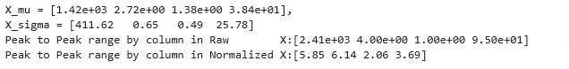
The peak of ranges is reduced from a factor of thousands to a factor of 2-3 by normalization
fig,ax=plt.subplots(1, 4, figsize=(12, 3))
for i in range(len(ax)):
    norm_plot(ax[i],X_train[:,i],)
    ax[i].set_xlabel(X_features[i])
ax[0].set_ylabel("count");
fig.suptitle("distribution of features before normalization")
plt.show()
fig,ax=plt.subplots(1,4,figsize=(12,3))
for i in range(len(ax)):
    norm_plot(ax[i],X_norm[:,i],)
    ax[i].set_xlabel(X_features[i])
ax[0].set_ylabel("count");
fig.suptitle("distribution of features after normalization")

plt.show()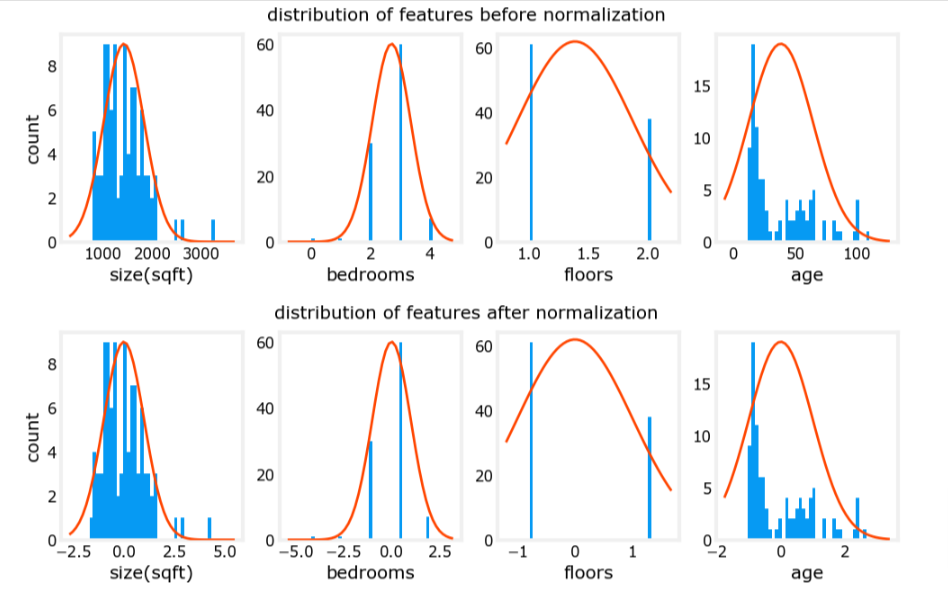
Notice, above, the range of the normalized data (x-axis) is centered around zero and roughly +/- 2. Most importantly, the range is similar for each feature.
Gradient Descent
Let’s rerun it with normalized data
w_norm, b_norm, hist = run_gradient_descent(X_norm, y_train, 1000, 1.0e-1, )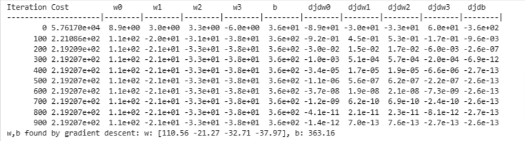
The scaled features get very accurate results much, much faster!. Notice the gradient of each parameter is tiny by the end of this fairly short run. A learning rate of 0.1 is a good start for regression with normalized features. Let’s plot our predictions versus the target values. Note, the prediction is made using the normalized feature while the plot is shown using the original feature values.
Predict
#predict target using normalized features
m = X_norm.shape[0]
yp = np.zeros(m)
for i in range(m):
    yp[i] = np.dot(X_norm[i], w_norm) + b_norm

    # plot predictions and targets versus original features
fig,ax=plt.subplots(1,4,figsize=(12, 3),sharey=True)
for i in range(len(ax)):
    ax[i].scatter(X_train[:,i],y_train, label = 'target')
    ax[i].set_xlabel(X_features[i])
    ax[i].scatter(X_train[:,i],yp,color=dlc["dlorange"], label = 'predict')
ax[0].set_ylabel("Price"); ax[0].legend();
fig.suptitle("target versus prediction using z-score normalized model")
plt.show()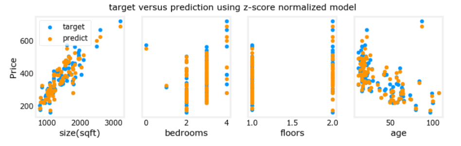
The results look good. A few points to note:
- with multiple features, we can no longer have a single plot showing results versus features.
- when generating the plot, the normalized features were used. Any predictions using the parameters learned from a normalized training set must also be normalized.
Prediction The point of generating our model is to use it to predict housing prices that are not in the data set. Let’s predict the price of a house with 1200 sqft, 3 bedrooms, 1 floor, 40 years old. Recall, that you must normalize the data with the mean and standard deviation derived when the training data was normalized.
# First, normalize out example.
x_house = np.array([1200, 3, 1, 40])
x_house_norm = (x_house - X_mu) / X_sigma
print(x_house_norm)
x_house_predict = np.dot(x_house_norm, w_norm) + b_norm
print(f" predicted price of a house with 1200 sqft, 3 bedrooms, 1 floor, 40 years old = ${x_house_predict*1000:0.0f}")
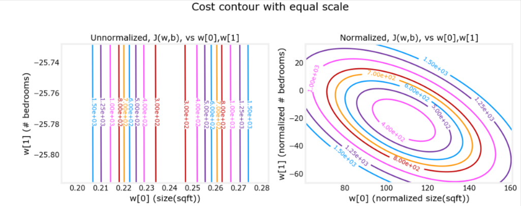
Cost Contour
This is related to the uneven data distribution explained earlier
plt_equal_scale(X_train, X_norm, y_train)